
#7A645C Hex Color
Online color picker to view shades, tints, color codes, and complementary colors
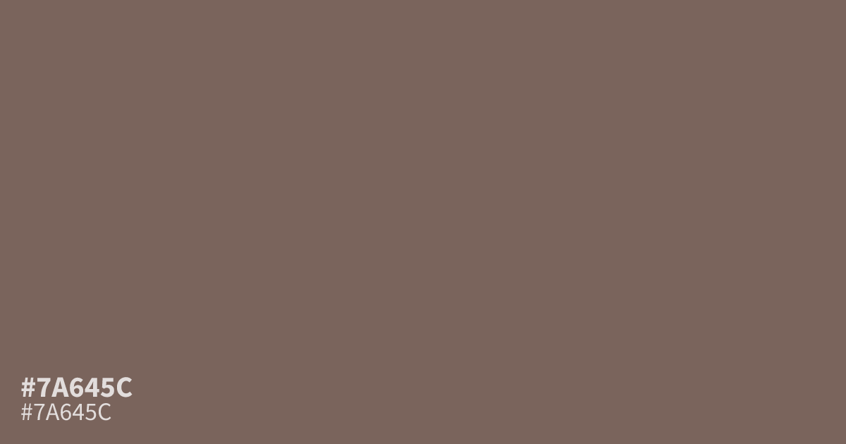
The hex code #7a645c describes a muted, dusky tone with gray, orange, and brown undertones. Its matte, low-saturation character suits vintage packaging, coffee and chocolate branding, autumn graphics, and construction safety designs. Use it as a supporting color beside cream or faded teal. White text has about a 5.5:1 contrast ratio, meeting WCAG AA for small body copy.
Questions about #7a645c
What is #7a645c in RGB, HSL and CMYK?
In RGB, #7a645c is rgb(122, 100, 92), in HSL hsl(16, 14%, 42%) and in CMYK 0%, 18%, 25%, 52%. Browse more shades of gray with names and hex codes.
What colors pair well with #7a645c?
Pair #7a645c with cream for a softer vintage look, or faded teal for restrained contrast; charcoal can strengthen text hierarchy without competing with its warm brown-gray base in packaging, editorial layouts, and other muted designs.
Does #7a645c look warm or cool?
It reads as a muted warm-neutral because its brown and orange undertones outweigh its gray component, while low saturation keeps the warmth subtle, making it better suited to earthy, vintage, and understated layouts than bright or high-energy palettes.
Where can designers use #7a645c?
Use #7a645c as a supporting color in vintage packaging, coffee or chocolate branding, autumn graphics, and construction safety designs. Its matte, low-saturation appearance works best with brighter accents or light neutrals rather than as a vivid focal color.
Is #7a645c readable on white or black?
#7a645c has a 5.51:1 contrast ratio on white and 3.80:1 on black. WCAG asks for 4.5:1 for body text and 3:1 for large text, so on white it works for body text and on black it works only for large text (24px, or 18.5px bold). Try other pairs in the contrast checker.