
#796E7D Hex Color
Online color picker to view shades, tints, color codes, and complementary colors
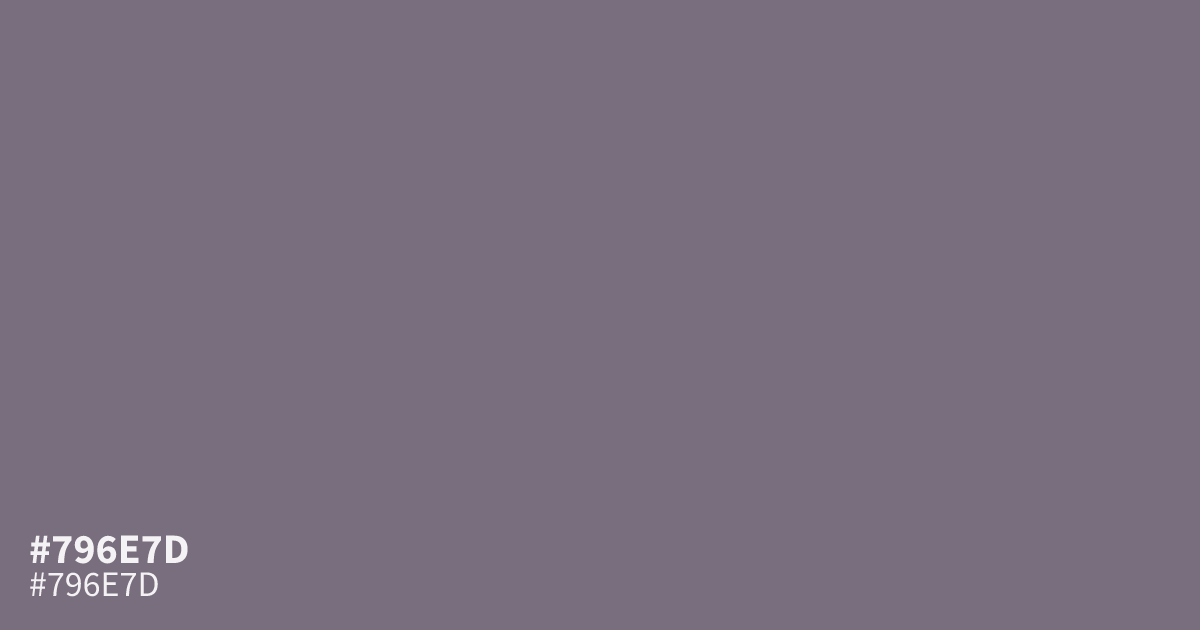
This dusty, muted violet reads more gray than purple. Its desaturated character makes it a sophisticated choice for UI backgrounds where you need to avoid high-contrast jarring. Because #796e7d holds enough visual weight, it pairs beautifully with clean, off-white text for readable body copy. Use this hex code as a neutral base to ground more saturated or vivid branding elements.
Questions about #796e7d
What is #796e7d in RGB, HSL and CMYK?
In RGB, #796e7d is rgb(121, 110, 125), in HSL hsl(284, 6%, 46%) and in CMYK 3%, 12%, 0%, 51%. Browse more shades of gray with names and hex codes.
Is #796e7d considered a warm or cool color?
While #796e7d sits in the purple family, its significant gray content makes it read as a cool, neutral tone. This gray influence allows it to function much like a neutral base rather than a vibrant purple, keeping interfaces grounded and calm.
What colors work best with #796e7d?
This color pairs beautifully with off-white or cream for high readability in UI layouts. To add visual interest, introduce deeper tones like charcoal or soft earthy greens, which complement the muted, desaturated nature of the violet base.
Is #796e7d readable on white or black?
#796e7d has a 4.83:1 contrast ratio on white and 4.33:1 on black. WCAG asks for 4.5:1 for body text and 3:1 for large text, so on white it works for body text and on black it works only for large text (24px, or 18.5px bold). Try other pairs in the contrast checker.