
#746C81 Hex Color
Online color picker to view shades, tints, color codes, and complementary colors
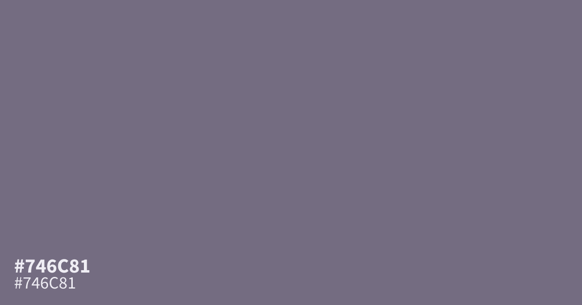
This dusty, muted purple sits on the boundary between violet and grey. Because of its desaturated, matte quality, #746c81 serves as a grounding background rather than a loud accent. It offers enough contrast for white text, making it a reliable choice for UI sections that need to feel calm and orderly. Pair it with soft, warm creams to prevent the palette from feeling too chilly.
Questions about #746c81
What is #746c81 in RGB, HSL and CMYK?
In RGB, #746c81 is rgb(116, 108, 129), in HSL hsl(263, 9%, 46%) and in CMYK 10%, 16%, 0%, 49%. Browse more shades of gray with names and hex codes.
How can I balance #746c81 to keep it from looking too chilly?
You can offset the inherent coolness of #746c81 by pairing it with warm neutrals like soft creams, light tans, or gentle beiges. These additions prevent the palette from feeling too clinical or disconnected, helping maintain a grounded and approachable atmosphere.
Does #746c81 work well as a primary interface background?
Yes, #746c81 functions effectively as a background color because its muted, desaturated quality minimizes eye strain. It provides a stable, orderly base that allows white text or high-contrast UI elements to stand out clearly without creating visual clutter.
Is #746c81 readable on white or black?
#746c81 has a 4.99:1 contrast ratio on white and 4.20:1 on black. WCAG asks for 4.5:1 for body text and 3:1 for large text, so on white it works for body text and on black it works only for large text (24px, or 18.5px bold). Try other pairs in the contrast checker.