
#736863 Hex Color
Online color picker to view shades, tints, color codes, and complementary colors
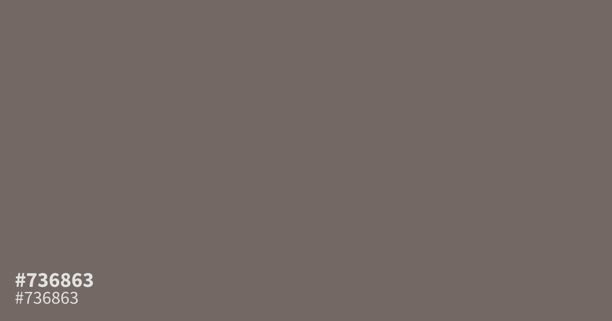
Somewhere between driftwood and cold coffee, #736863 is an ashy brown with only a trace of orange left in it. Its low saturation keeps things subdued, so it works best as a supporting tone behind cream type or next to burnt orange accents. White text passes AA on it at about 5.4:1 contrast. In large areas it can read muddy, so use it with restraint.
Questions about #736863
What is #736863 in RGB, HSL and CMYK?
In RGB, #736863 is rgb(115, 104, 99), in HSL hsl(19, 7%, 42%) and in CMYK 0%, 10%, 14%, 55%. Browse more shades of gray with names and hex codes.
What colors pair well with #736863?
Cream, burnt orange, and deep teal all pair well with #736863. Its low saturation needs neighbors of similar softness or enough contrast to stand apart, so skip neon brights that overpower it.
Is #736863 readable on white or black?
#736863 has a 5.39:1 contrast ratio on white and 3.88:1 on black. WCAG asks for 4.5:1 for body text and 3:1 for large text, so on white it works for body text and on black it works only for large text (24px, or 18.5px bold). Try other pairs in the contrast checker.