
#728B98 Hex Color
A muted, ashy blue for professional design
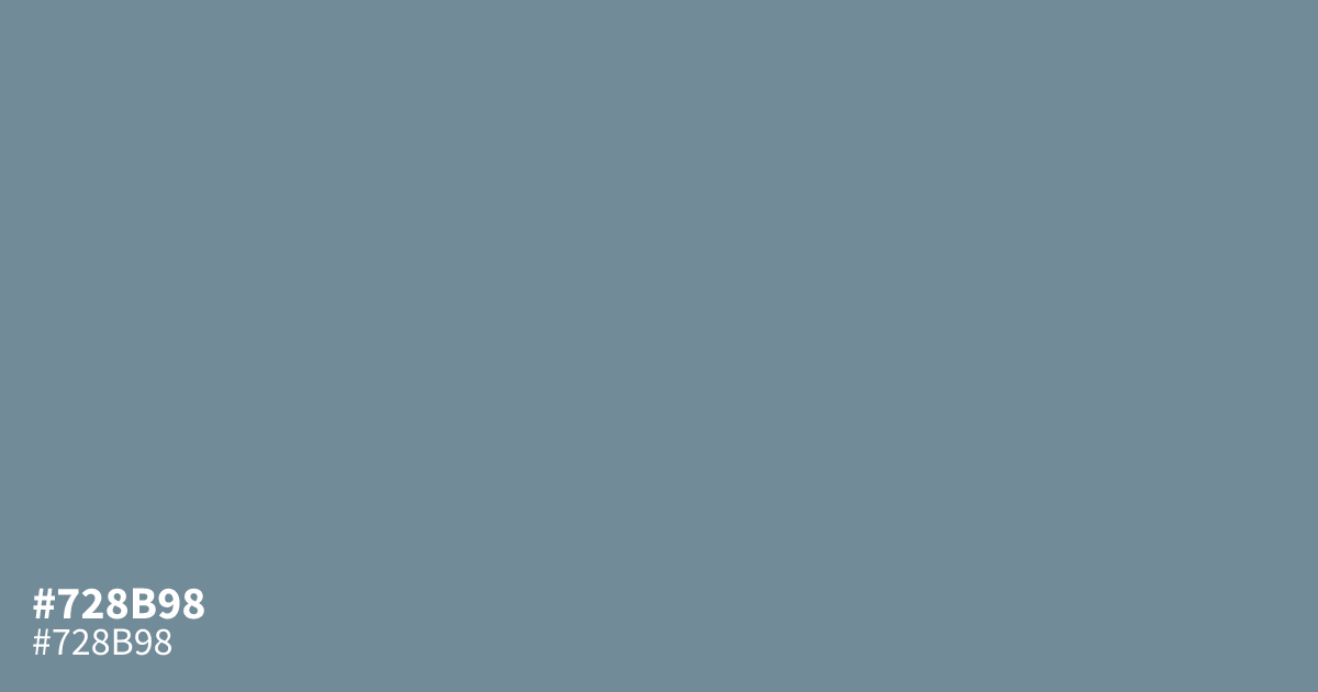
A dusty, ashy blue, #728b98 feels restrained and utilitarian. Its muted saturation removes any aggressive quality, making it a reliable choice for corporate interfaces, finance apps, or professional backgrounds. Pair this shade with crisp white text to ensure readability, as it maintains enough contrast for small body copy. This hex code works best as a neutral supporting tone rather than a vibrant focal point.
Questions about #728b98
What is #728b98 in RGB, HSL and CMYK?
In RGB, #728b98 is rgb(114, 139, 152), in HSL hsl(201, 16%, 52%) and in CMYK 25%, 9%, 0%, 40%. Browse more shades of gray with names and hex codes.
What colors pair best with #728b98 for a professional look?
#728b98 works effectively when paired with charcoal for high-contrast typography or crisp white to enhance its clean, corporate aesthetic. Because this ashy blue is desaturated and muted, it also functions beautifully alongside soft grays or deep navies to create a balanced, cohesive UI layout.
Is #728b98 suitable for body text or UI interface elements?
Use #728b98 primarily as a supporting background, border, or button accent rather than for body text, as it may lack sufficient contrast against white backgrounds. While it feels sophisticated and modern, verify your specific implementation against WCAG contrast standards to ensure readability for all users.
Is #728b98 readable on white or black?
#728b98 has a 3.58:1 contrast ratio on white and 5.86:1 on black. WCAG asks for 4.5:1 for body text and 3:1 for large text, so on white it works only for large text (24px, or 18.5px bold) and on black it works for body text. Try other pairs in the contrast checker.