
#726D7A Hex Color
A dusty, muted shadow of purple
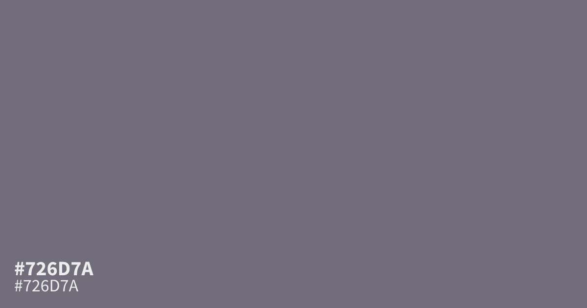
This dusty, ashy purple reads like a desaturated shadow. Because #726d7a is muted and dark, it functions best as a stabilizing background or a supporting neutral in complex palettes rather than a vibrant focal point. It pairs surprisingly well with warm metallic accents or soft creams. With a 5.0:1 contrast ratio, it remains readable even with standard white body text for modern UI.
Questions about #726d7a
What is #726d7a in RGB, HSL and CMYK?
In RGB, #726d7a is rgb(114, 109, 122), in HSL hsl(263, 6%, 45%) and in CMYK 7%, 11%, 0%, 52%. Browse more shades of gray with names and hex codes.
How should I use #726d7a in a user interface?
#726d7a functions best as a stabilizing background or a subtle secondary element rather than a focal point. Because it sits at a 5.0:1 contrast ratio against white, it remains readable for standard body text while providing a sophisticated, less aggressive alternative to pure gray.
What colors pair well with #726d7a?
This ashy purple pairs best with warm metallic accents or soft, creamy neutrals that balance its cool, desaturated undertones. Combining #726d7a with a cream or a warm metallic gold creates a grounded, professional palette suitable for wellness or premium brand design.
Is #726d7a readable on white or black?
#726d7a has a 5.01:1 contrast ratio on white and 4.18:1 on black. WCAG asks for 4.5:1 for body text and 3:1 for large text, so on white it works for body text and on black it works only for large text (24px, or 18.5px bold). Try other pairs in the contrast checker.