
#726C6A Hex Color
Online color picker to view shades, tints, color codes, and complementary colors
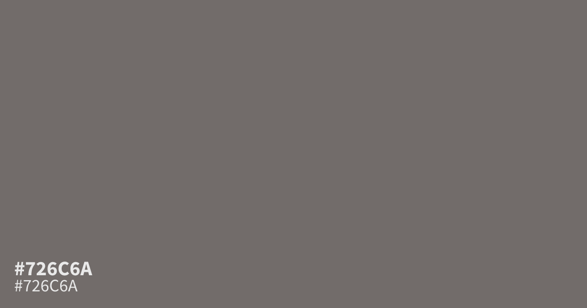
#726c6a is a muted, medium-dark grey with warm brown undertones and a dusty, ashy finish. Its restrained character suits professional interfaces, architectural palettes, and minimal layouts without feeling stark. Use it as a supporting tone with ivory or muted blue. As a UI background, it supports white text at about 5.2:1 contrast. The hex code is #726c6a.
Questions about #726c6a
What is #726c6a in RGB, HSL and CMYK?
In RGB, #726c6a is rgb(114, 108, 106), in HSL hsl(15, 4%, 43%) and in CMYK 0%, 5%, 7%, 55%. Browse more shades of gray with names and hex codes.
What colors pair well with #726c6a?
#726c6a pairs well with ivory, muted blue, and soft beige because its warm brown undertones balance pale, cool, or natural accents without creating harsh contrast in interfaces and interior-inspired palettes. Use ivory for a polished scheme and muted blue for a quieter counterpoint.
Is #726c6a warm or cool?
#726c6a reads as a warm gray because its muted brown undertones add subtle warmth beneath the neutral surface, with the warm reading clearest beside crisp white, cool gray, or blue accents. Its dusty finish keeps the overall effect restrained rather than strongly brown.
Does #726c6a work with white text?
Yes, #726c6a supports white text at roughly a 5.2:1 contrast ratio, which passes WCAG AA for normal text and makes it practical for UI backgrounds, cards, labels, and navigation elements. Verify contrast again if transparency or nearby colors alter the final result.
Where does #726c6a work best?
#726c6a works best as a supporting background, border, or secondary surface in professional interfaces, architectural layouts, and minimal designs where its dusty gray-brown character can add depth without the starkness of pure black. Pair it with lighter neutrals when more visual separation is needed.
Is #726c6a readable on white or black?
#726c6a has a 5.16:1 contrast ratio on white and 4.06:1 on black. WCAG asks for 4.5:1 for body text and 3:1 for large text, so on white it works for body text and on black it works only for large text (24px, or 18.5px bold). Try other pairs in the contrast checker.