
#6F727E Hex Color
Online color picker to view shades, tints, color codes, and complementary colors
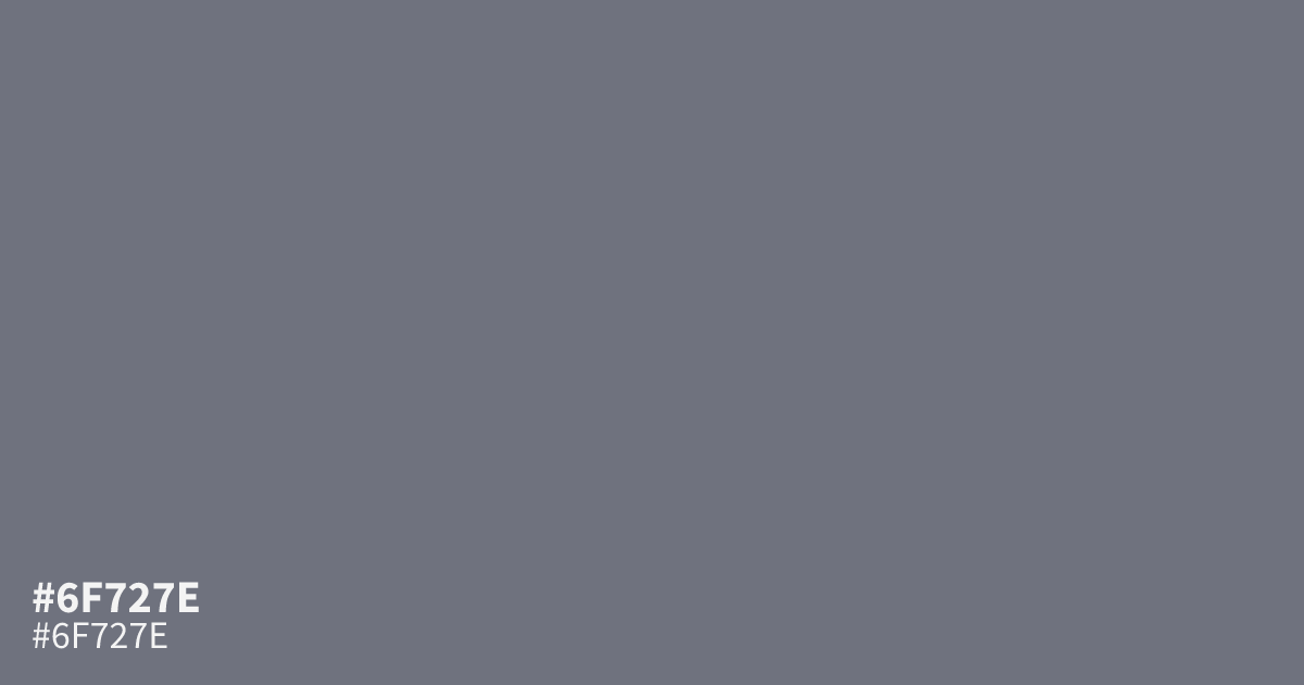
This dusty indigo features heavy grey undertones that create a serious, grounded character. Because it is highly desaturated, #6f727e works best as a supporting background color rather than a main focal point. White text remains legible against this shade, making it a reliable choice for modern UI interfaces. Use this hex code alongside warm cream or terracotta to add necessary contrast to your palette.
Questions about #6f727e
What is #6f727e in RGB, HSL and CMYK?
In RGB, #6f727e is rgb(111, 114, 126), in HSL hsl(228, 6%, 46%) and in CMYK 12%, 10%, 0%, 51%. Browse more shades of gray with names and hex codes.
How should I use #6f727e in a UI layout?
Use #6f727e primarily as a neutral background for modern interfaces because its heavy grey undertones keep the visual noise low. It provides enough weight to support white text comfortably while letting brighter call-to-action buttons pop against the desaturated surface.
Which colors complement #6f727e for a balanced palette?
Pair #6f727e with warm, organic tones like terracotta or soft cream to counteract its cool, grey-heavy personality. This contrast creates a sophisticated look that prevents the overall design from feeling too cold or overly sterile in its presentation.
Is #6f727e readable on white or black?
#6f727e has a 4.79:1 contrast ratio on white and 4.38:1 on black. WCAG asks for 4.5:1 for body text and 3:1 for large text, so on white it works for body text and on black it works only for large text (24px, or 18.5px bold). Try other pairs in the contrast checker.