
#636B56 Hex Color
Online color picker to view shades, tints, color codes, and complementary colors
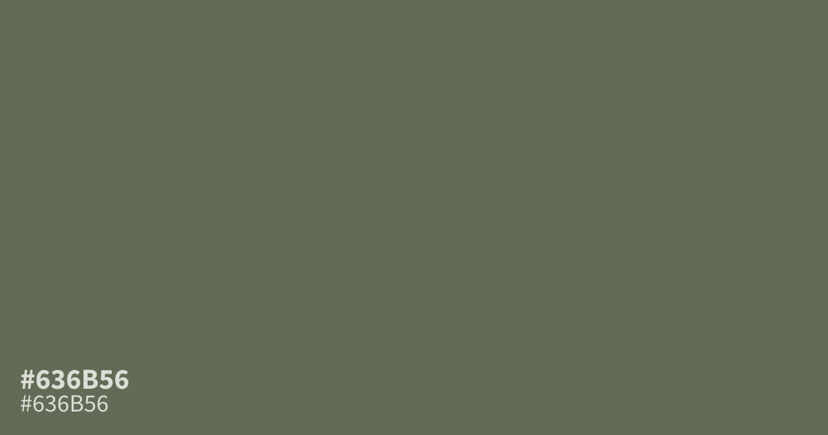
This dusty, olive-toned grey feels muted and grounded. Because #636b56 has low saturation, it works best as a supporting background rather than a main focus. Use it with clean white text to ensure readability, as it provides a solid 5.6:1 contrast ratio. Pair this shade with soft terracotta or warm creams to keep your palette from feeling too gloomy or flat.
Questions about #636b56
What is #636b56 in RGB, HSL and CMYK?
In RGB, #636b56 is rgb(99, 107, 86), in HSL hsl(83, 11%, 38%) and in CMYK 7%, 0%, 20%, 58%. Browse more shades of gray with names and hex codes.
What colors pair well with #636b56?
This muted olive grey works best alongside warm, organic neutrals to prevent a flat appearance. Try balancing it with terracotta to add a necessary pop of warmth or soft cream tones to keep your design feeling bright and accessible.
Is #636b56 suitable for text on a white background?
Yes, #636b56 provides a solid 5.6:1 contrast ratio against pure white, making it safe for most readability standards. It offers a softer, more sophisticated alternative to standard black text, which can often feel too harsh in minimalist, earthy design schemes.
Is #636b56 readable on white or black?
#636b56 has a 5.57:1 contrast ratio on white and 3.76:1 on black. WCAG asks for 4.5:1 for body text and 3:1 for large text, so on white it works for body text and on black it works only for large text (24px, or 18.5px bold). Try other pairs in the contrast checker.