
#614745 Hex Color
Online color picker to view shades, tints, color codes, and complementary colors
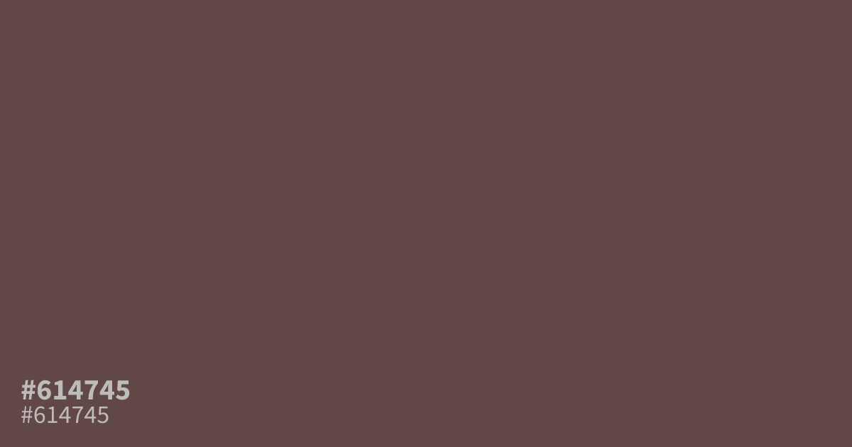
This dusty, muted red has a heavy, matte quality that feels grounded and serious. Because #614745 is so unsaturated, it works best as a moody background or a subtle supporting element rather than a primary color. Pair it with soft cream or warm white, as the contrast ratio is excellent for readability. Avoid using it in large, flat blocks where it might read too muddy.
Questions about #614745
What is #614745 in RGB, HSL and CMYK?
In RGB, #614745 is rgb(97, 71, 69), in HSL hsl(4, 17%, 33%) and in CMYK 0%, 27%, 29%, 62%. Browse more shades of gray with names and hex codes.
What colors pair best with #614745?
#614745 functions beautifully alongside soft, warm neutrals like cream or off-white to maintain readability without overwhelming the eye. You can also pair it with a deep charcoal to create a high-contrast, professional look that keeps the overall aesthetic grounded and moody.
Does #614745 read as warm or cool?
This color reads distinctly warm, leaning into earthy brown and terracotta territory due to its heavy, desaturated composition. Because it lacks brightness, it avoids feeling aggressive, instead providing a steady, reliable warmth that makes it an excellent choice for calm or vintage-inspired branding projects.
Is #614745 readable on white or black?
#614745 has a 8.41:1 contrast ratio on white and 2.49:1 on black. WCAG asks for 4.5:1 for body text and 3:1 for large text, so on white it works for body text and on black it is too faint for text. Try other pairs in the contrast checker.