
#5E6B79 Hex Color
Online color picker to view shades, tints, color codes, and complementary colors
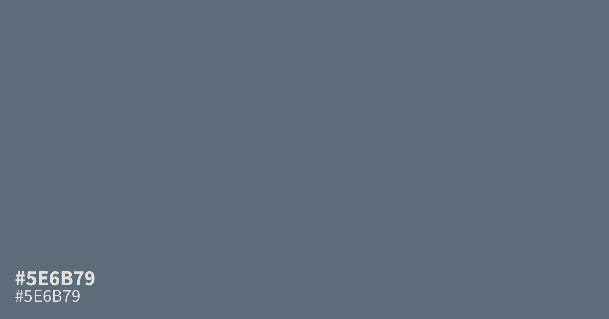
This dusty, slate-like blue offers a somber, muted presence that works well for reliable UI backgrounds or corporate branding. With its heavy grey undertone, #5e6b79 provides a grounded, stable base rather than a bright accent. It pairs effectively with crisp white text, as the contrast ratio is sufficient for readability. Use it sparingly, as its dim nature can look muddy when covering overly large, empty sections of a layout.
Questions about #5e6b79
What is #5e6b79 in RGB, HSL and CMYK?
In RGB, #5e6b79 is rgb(94, 107, 121), in HSL hsl(211, 13%, 42%) and in CMYK 22%, 12%, 0%, 53%. Browse more shades of gray with names and hex codes.
What colors pair best with #5e6b79 for UI design?
Pair #5e6b79 with crisp, clean neutrals like off-white or soft cream to create high-contrast, readable layouts. For accents, consider using a subtle mustard or muted terracotta to add warmth without disrupting the professional, grounded aesthetic of this slate blue.
Does #5e6b79 function well as a primary brand color?
#5e6b79 works exceptionally well as a primary color for brands that need to project stability, trust, and a calm, corporate presence. Because of its heavy grey undertone, it feels less aggressive than pure blue and sits nicely on digital interfaces.
Is #5e6b79 readable on white or black?
#5e6b79 has a 5.44:1 contrast ratio on white and 3.85:1 on black. WCAG asks for 4.5:1 for body text and 3:1 for large text, so on white it works for body text and on black it works only for large text (24px, or 18.5px bold). Try other pairs in the contrast checker.