
#424530 Hex Color
A serious, muted olive with earthy depths
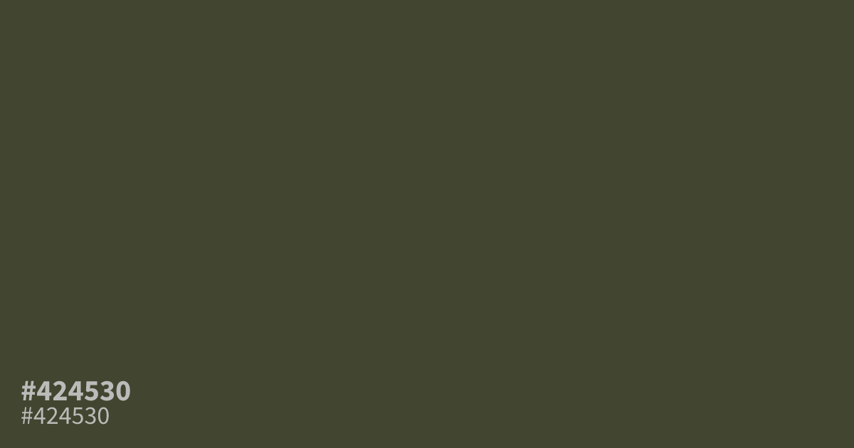
This dark, muted olive tone feels serious and grounded. With its desaturated, dusty quality, #424530 works best as a sophisticated supporting accent rather than a dominant background. It pairs exceptionally well with muted oranges or cream, creating an earthy palette for organic branding or outdoor themes. Because it offers strong contrast against white text, it remains legible in UI designs that require a moody, matte aesthetic.
Questions about #424530
What is #424530 in RGB, HSL and CMYK?
In RGB, #424530 is rgb(66, 69, 48), in HSL hsl(69, 18%, 23%) and in CMYK 4%, 0%, 30%, 73%. Browse more shades of gray with names and hex codes.
What colors pair well with #424530 in a design scheme?
#424530 works best alongside warm, muted neutrals or soft, desaturated oranges. Try pairing it with cream for a balanced organic look, or use a soft terracotta to highlight the earthy, matte nature of the olive tone without overwhelming the palette.
Is #424530 a suitable choice for body text on a white background?
#424530 provides decent contrast against white, though it may feel heavy depending on the font weight used. It is safer to use this color for UI accents or secondary headers, ensuring your primary body text remains a darker, more standard tone for optimal readability.
Is #424530 readable on white or black?
#424530 has a 9.87:1 contrast ratio on white and 2.12:1 on black. WCAG asks for 4.5:1 for body text and 3:1 for large text, so on white it works for body text and on black it is too faint for text. Try other pairs in the contrast checker.