
#3E414E Hex Color
Online color picker to view shades, tints, color codes, and complementary colors
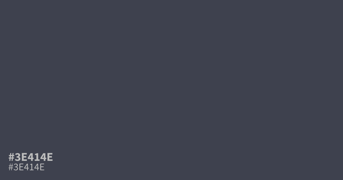
Muted and almost gray, #3e414e is a dark indigo with a dusty, ashy finish and low saturation. Its matte depth brings mystery, seriousness, and calm to moody layouts. Use it as a dominant background or structural tone, especially in dark interfaces and night-sky themes. The hex code #3e414e supports white text at about 10.1:1 contrast.
Questions about #3e414e
What is #3e414e in RGB, HSL and CMYK?
In RGB, #3e414e is rgb(62, 65, 78), in HSL hsl(229, 11%, 27%) and in CMYK 21%, 17%, 0%, 69%. Browse more shades of gray with names and hex codes.
What colors pair well with #3e414e?
Muted gold, dusty rose, and soft cream pair well with #3e414e because they add warmth and lift its low-saturation indigo base without competing with its restrained, charcoal-like depth in branding, editorial layouts, and dark interfaces. Use lighter tones for space, borders, or focused accents.
Does #3e414e read warm or cool?
#3e414e reads cool because its very low saturation is paired with a slight blue-violet cast, though its gray content keeps the effect restrained rather than bright or icy in most palettes. Warm off-whites and muted metallic accents can balance that cooler impression.
Where does #3e414e work best in a design?
#3e414e works best as a dominant dark background, navigation surface, or supporting structural tone, where its low saturation creates a serious, matte setting for brighter type and focused accent colors. Its strong white-text contrast also suits dark interfaces and large display areas.
Is #3e414e readable on white or black?
#3e414e has a 10.14:1 contrast ratio on white and 2.07:1 on black. WCAG asks for 4.5:1 for body text and 3:1 for large text, so on white it works for body text and on black it is too faint for text. Try other pairs in the contrast checker.