
#3C6861 Hex Color
Online color picker to view shades, tints, color codes, and complementary colors
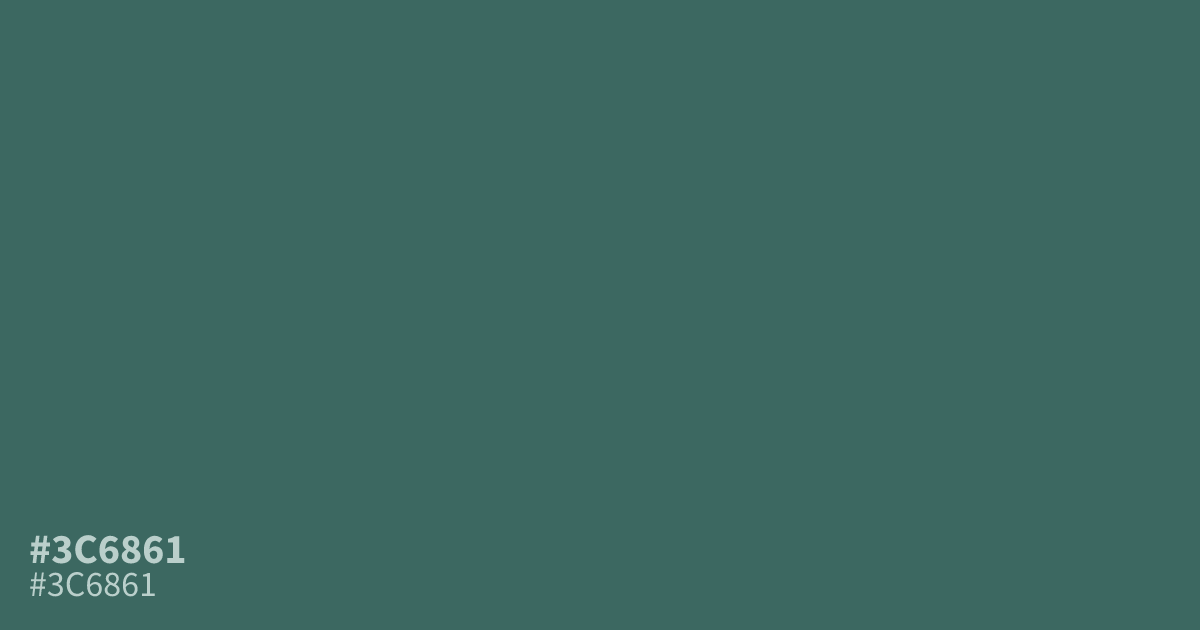
This dim, dusty teal leans into a cool, desaturated aesthetic that works well for moody interfaces. Because #3c6861 is quite dark, it provides enough contrast for white text to remain readable at small sizes. Pair this shade with soft creams or warm grays to soften its serious, grounded personality. It serves as an excellent base for wellness or healthcare branding where clarity is needed.
Questions about #3c6861
What is #3c6861 in RGB, HSL and CMYK?
In RGB, #3c6861 is rgb(60, 104, 97), in HSL hsl(170, 27%, 32%) and in CMYK 42%, 0%, 7%, 59%.
Does #3c6861 work well for UI backgrounds?
#3c6861 serves best as a background or accent color rather than for body text. Its dark saturation provides excellent contrast for white or light cream text, creating a professional look that remains highly readable on modern screens.
Which colors pair best with #3c6861?
You can balance this dusty teal by pairing it with cream or warm gray to soften its intensity. These neutral tones complement its cool undertones, making it a reliable choice for wellness-focused or medical interface design.
Is #3c6861 readable on white or black?
#3c6861 has a 6.27:1 contrast ratio on white and 3.34:1 on black. WCAG asks for 4.5:1 for body text and 3:1 for large text, so on white it works for body text and on black it works only for large text (24px, or 18.5px bold). Try other pairs in the contrast checker.