
#355249 Hex Color
Online color picker to view shades, tints, color codes, and complementary colors
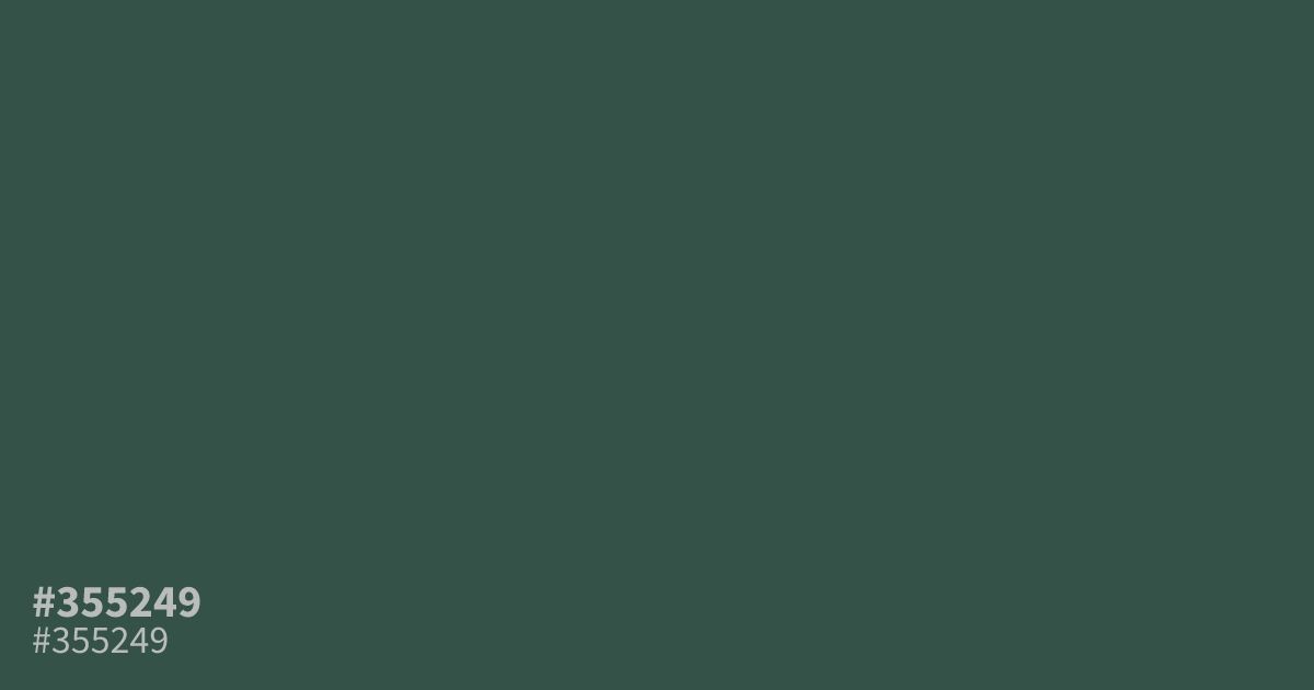
This muted, dark teal feels sophisticated and grounded. Because of its low saturation and heavy ash undertones, it works best as a moody base color rather than an accent. Pair #355249 with crisp white text to achieve a readable 8.6:1 contrast ratio for UI designs. It adds professional weight to corporate branding or wellness websites where understated color palettes are needed.
Questions about #355249
What is #355249 in RGB, HSL and CMYK?
In RGB, #355249 is rgb(53, 82, 73), in HSL hsl(161, 21%, 26%) and in CMYK 35%, 0%, 11%, 68%. Browse more shades of gray with names and hex codes.
What colors pair well with #355249 in UI design?
This muted dark teal works exceptionally well with crisp, high-contrast off-white or light cream backgrounds to maintain readability. For a balanced palette, consider soft accent tones like warm copper or muted gold to introduce visual interest without overpowering the professional, grounded nature of the main hue.
Is #355249 suitable for text on a white background?
Yes, #355249 provides excellent readability against light backgrounds, achieving a high contrast ratio of over 8:1 when paired with standard white. This makes it a strong, accessible choice for headlines or primary body text in corporate or wellness branding where you want a softer look than pure black.
Is #355249 readable on white or black?
#355249 has a 8.55:1 contrast ratio on white and 2.45:1 on black. WCAG asks for 4.5:1 for body text and 3:1 for large text, so on white it works for body text and on black it is too faint for text. Try other pairs in the contrast checker.