
#31424A Hex Color
Online color picker to view shades, tints, color codes, and complementary colors
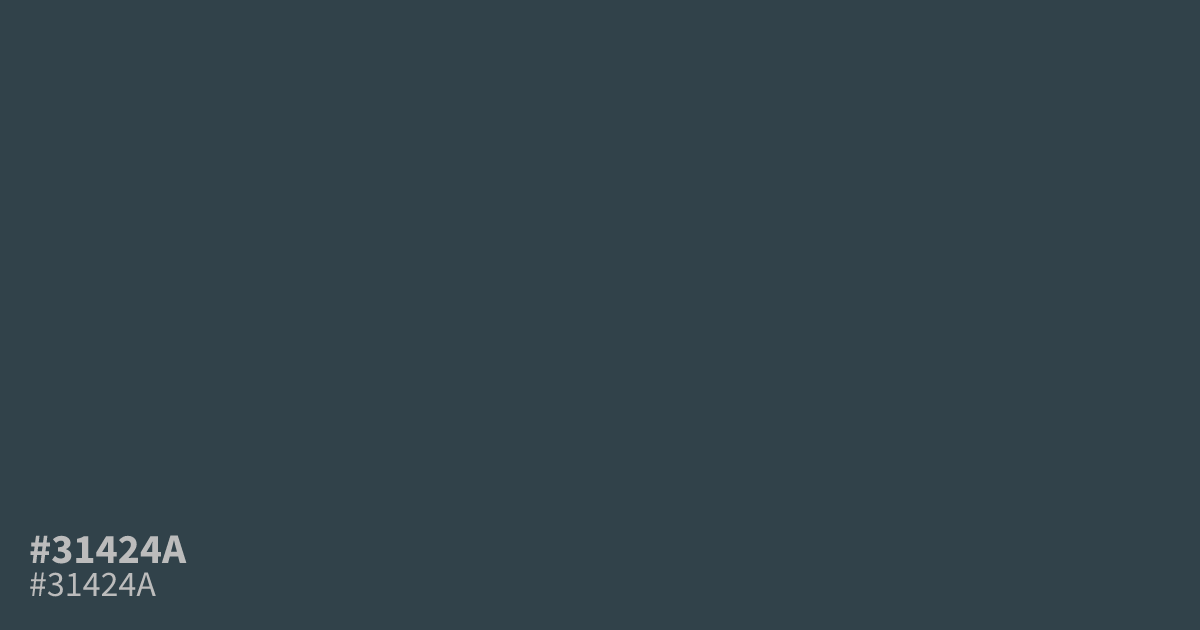
#31424a is a moody, muted blue with strong gray undertones. This dark, inky shade evokes a sense of mystery and serious depth, making it a reliable choice for professional technology or security interfaces. Because it is matte and understated, it functions well as a balanced background for clean, modern designs. The hex code for this dusty blue is #31424a.
Questions about #31424a
What is #31424a in RGB, HSL and CMYK?
In RGB, #31424a is rgb(49, 66, 74), in HSL hsl(199, 20%, 24%) and in CMYK 34%, 11%, 0%, 71%. Browse more shades of gray with names and hex codes.
What kind of color is #31424a?
This is a dark, muted blue that leans heavily into gray and slate undertones. It functions as a sophisticated neutral, offering a matte appearance that feels professional, grounded, and significantly more serious than a standard vibrant navy blue.
What colors pair well with #31424a?
Pair this deep slate blue with soft creams, crisp whites, or muted metallics to create a high-contrast, clean aesthetic. You can also use warm, desaturated gold or clay tones to provide a subtle pop of color against its dark base.
Is #31424a considered a warm or cool color?
This color sits firmly on the cool side of the spectrum due to its deep blue and gray composition. While it lacks the icy sharpness of pure blues, it maintains a chilly, professional temperature that works best in modern, minimalist design schemes.
Where should I use #31424a in a design?
Use this color as a primary background for technology, finance, or security-focused user interfaces where readability and a serious tone are required. It provides excellent contrast for white text while feeling much softer and more contemporary than pure black.
Is #31424a readable on white or black?
#31424a has a 10.45:1 contrast ratio on white and 2.00:1 on black. WCAG asks for 4.5:1 for body text and 3:1 for large text, so on white it works for body text and on black it is too faint for text. Try other pairs in the contrast checker.