
#234645 Hex Color
Online color picker to view shades, tints, color codes, and complementary colors
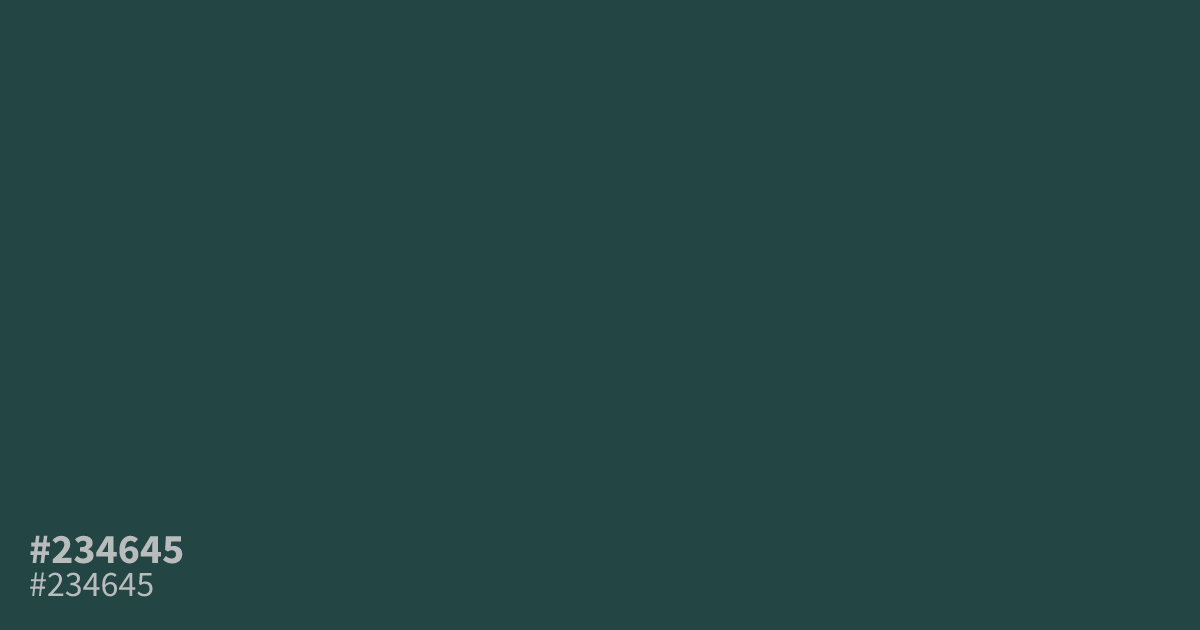
Darker than sea glass and grayer than pine, this dim teal carries an ashy, muted cast. #234645 works best as a dominant base in dark mode UI and moody brand palettes. White text sits at about 10.3:1 contrast here, so small body copy stays readable. Warm accents like terracotta or rust bring out its green undertone better than cool blues.
Questions about #234645
What is #234645 in RGB, HSL and CMYK?
In RGB, #234645 is rgb(35, 70, 69), in HSL hsl(178, 33%, 21%) and in CMYK 50%, 0%, 1%, 73%.
What text color works best on #234645?
White text reads most clearly, hitting roughly 10.3:1 contrast, which passes WCAG AA for small body text. Black text falls far short of the 4.5:1 threshold, so keep dark type off this color.
What colors pair well with #234645?
Warm accents like terracotta and rust lift its gray-green undertone, while dusty coral adds contrast without clashing. Cool blues tend to flatten it, so lean warm in your accent choices.
Is #234645 readable on white or black?
#234645 has a 10.32:1 contrast ratio on white and 2.03:1 on black. WCAG asks for 4.5:1 for body text and 3:1 for large text, so on white it works for body text and on black it is too faint for text. Try other pairs in the contrast checker.