
#022E27 Hex Color
Online color picker to view shades, tints, color codes, and complementary colors
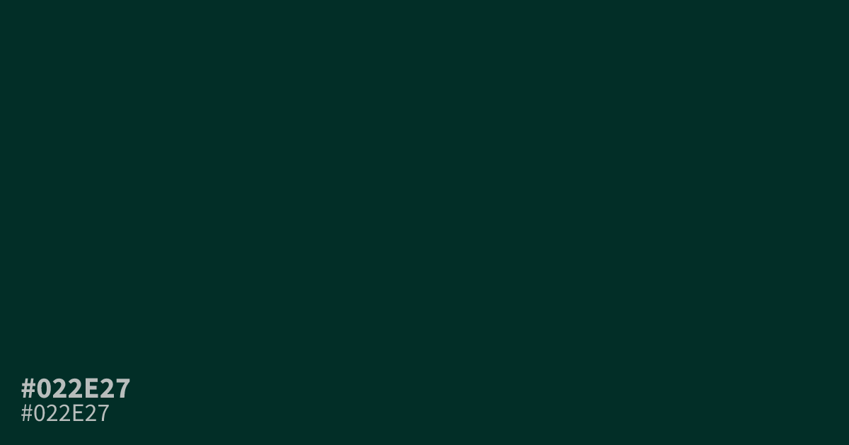
This dark, muted teal carries a heavy, serious presence due to its near-black saturation. Because it absorbs so much light, #022e27 works best as a sophisticated background in dark mode UI, offering high legibility for white text. Avoid using it for small, fine details where the subtle green undertones might vanish entirely. It pairs well with soft gold or warm cream for a balanced, premium contrast.
Questions about #022e27
What is #022e27 in RGB, HSL and CMYK?
In RGB, #022e27 is rgb(2, 46, 39), in HSL hsl(170, 92%, 9%) and in CMYK 96%, 0%, 15%, 82%.
How should I use #022e27 in digital design?
#022e27 works best as a primary background color for dark mode interfaces because its heavy, near-black saturation offers excellent readability for white or light-colored text. Avoid using this deep tone for small icons or thin typography where the subtle green undertones might completely disappear.
What colors pair well with #022e27?
This deep teal balances beautifully with soft gold or warm cream tones, which prevent the layout from feeling too cold or severe. These accents create a premium, grounded contrast that keeps the overall design sophisticated rather than flat or purely functional.
Is #022e27 readable on white or black?
#022e27 has a 14.76:1 contrast ratio on white and 1.42:1 on black. WCAG asks for 4.5:1 for body text and 3:1 for large text, so on white it works for body text and on black it is too faint for text. Try other pairs in the contrast checker.